Escape Mate, redesigned
An unsolicited redesign by a fan. It shows how Wellington's original escape room could sell its three missions online as well as it runs them in real life.
What was getting in the way
Repetition
The full 14-clause T&Cs and the same "highlights" block were repeated on every room page. Each page ran to thousands of words, and the key facts got buried.
Inconsistent data
Difficulty showed as 6/10 on one page and 3.5/5 on another. Atlantis was listed as both accessible and not accessible. Opening time read "9.30pm".
Weak booking path
"Book now" lived inside an iframe button with no context, there was no CTA on mobile, and nothing helped a visitor choose a room.
No visual system
Gradient Wix buttons and mixed fonts on a flat purple. The rooms' amazing art direction didn't come through.
Hidden story
All three rooms share the same fiction, the Escape Mate Intelligence Agency, but the site never used it.
Performance
About 1 MB of HTML per page, with Twitter widgets, chat, and Wix runtime scripts on top.
What the best do, and what nobody does
The Escape Game
Borrowed: a trust-stat bar up front, reviews with real group photos, and the "we build it in-house" story.
Avoided: "Book" sends you to a location picker, which is one extra step before choosing a game.
Escape Rooms NZ / Lost
Borrowed: intent filters (First timer, Kids, Wheelchair) and a location tag on every room card.
Avoided: cards without price, player count or difficulty, which forces extra clicks to compare.
Escape Rooms Wellington · Escape Masters · XCape
These are template sites with a list of rooms and a booking widget. None of them uses narrative or gives each room its own visual identity.
Opportunity: win on storytelling and clarity, not on volume.
Conversion patterns
Short booking paths, a persistent CTA, price and availability shown early, and add-ons (gift cards, events) placed next to the main action.
The site is the agency terminal
The global layer is a dark "ops room" in the logo's pink, purple and yellow, with mono dossier labels and a 60:00 countdown motif. Each mission then gets its own skin:
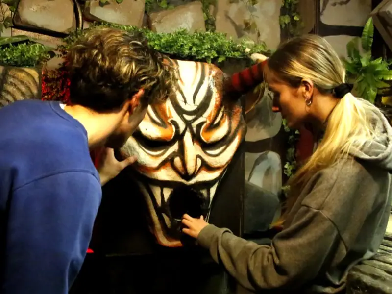
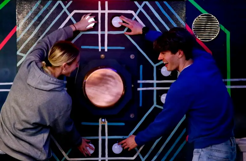

- Temple: carved stone & torchlightCinzel display type, a gold gradient, a flickering torch glow and Mayan glyph dividers.
- Spaceship: vault HUDChakra Petch type, alien-green scanlines, a live radar sweep, a distress-signal waveform and chamfered buttons.
- Atlantis: descend into the abyssCormorant type, a gradient that darkens as you scroll, a depth gauge, bioluminescent bubbles and caustic light.
- Shared mechanic: redacted briefingsEach story hides key lines behind redaction bars that you reveal by hovering or tapping, so reading the lore becomes the first puzzle.
Selling without breaking the spell
- Mission MatcherSquad size, kids, vibe, experience and accessibility produce a recommended room and a live price. The logic comes straight from the FAQ.
- Comparable dossiersEvery room shows the same stats on the same scale (players, difficulty /10, venue), so visitors can compare at a glance.
- Booking always one tap awayA sticky header CTA, plus a bottom booking bar with a call button on mobile. All CTAs go straight to the existing Xola checkout.
- One source of truthT&Cs moved to a single page with an at-a-glance summary. The FAQ is searchable, and events merge corporate and parties into tabs.
- Accessible & lightSemantic HTML, AA contrast, visible focus, 44px targets and reduced-motion support. Static files and no framework.